 |
| Umai-ya, giving ppl have zen feeling.. |

Sunday, January 16, 2011
Sunday, January 9, 2011


html and css code library~
wow, script library can know many function..
http://www.dynamicdrive.com/style/csslibrary/item/css_smart_image_enlarger/
http://www.dynamicdrive.com/style/csslibrary/item/arrow_bullet_list_menu/
http://psacake.com/web/fb.asp
http://www.codesupplier.com/htmlquickchart.htm
http://www.codesupplier.com/mouseovercolourtext.htm
http://www.dynamicdrive.com/style/csslibrary/item/css_smart_image_enlarger/
http://www.dynamicdrive.com/style/csslibrary/item/arrow_bullet_list_menu/
http://psacake.com/web/fb.asp
http://www.codesupplier.com/htmlquickchart.htm
http://www.codesupplier.com/mouseovercolourtext.htm
Photoshop skill tutorial~
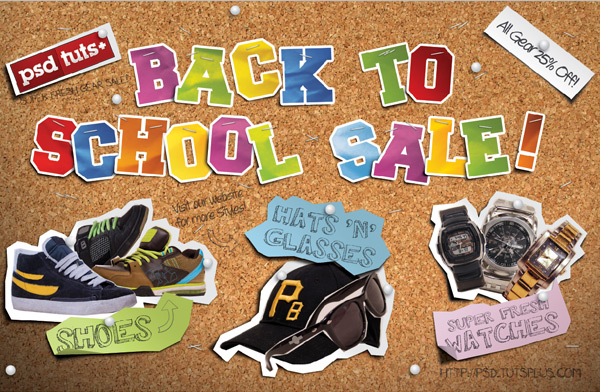
Create a Handmade “Back to School” Style Postcard
>> http://psd.tutsplus.com/tutorials/tutorials-effects/create-a-handmade-back-to-school-style-postcard/
Create a Beautiful, Unique Website Header

Create this 2010 Typographic Wallpaper in Photoshop
>> http://photoshoptutorials.ws/photoshop-tutorials/text-effects/create-this-2010-typographic-wallpaper-in-photoshop.html

Make a Story Book Come to Life in Photoshop
>> http://photoshoptutorials.ws/photoshop-tutorials/photo-manipulation/make-a-story-book-come-to-life-in-photoshop.html")
my website Topic : Umai-ya
 |
| This Homepage is really not like a home page, some more home page 1st info is location, and then navigation bar there still have location. |
 |
| There is a lot of space at bottom of the website, it just using blog default layout, that is bored too. |
 |
| The location info can be seen at right side, and then the navigation bar click will show another location page. their important thing is location? i think food more important.. |
 |
| The info, typo, colour is not match and not obvious. the font size should big abit, and the colour should choose more contrast colour, and have to add hirachy inside. |
Beautiful and useful commercial Website
 |
| This website layout is nice, with the impactful image tat create the whole website mood, and the link, button is all below just suitable and didnt block the image. |
 |
| This website have beautiful typography and their product is showing very clearly, and the hirachy of the typo is very obvious. |
 |
| This interface is intresting, that having the table on below, and the navigation is also in below, with the theme or suitable background image. |
 |
| The navigation bar is beautiful, like the floating word that coming with the middle navigation. they use the image very well with combining with the info, and picture. |
Competitor Website vs Umai-Ya
 |
-well, this sushi zanmai, the interface main colour is bored, it have to be more texture or more intresting colour. the layout is ok, but the typo can be more good. |
 |
| -This Zen japanese restaurent website, have better vision then sushi zanmai because it have background image, and the interface show more food, to attract user. |
 |
| -Fuki Sushi using picture as the background of every page, is a nice way to promote and make the website beautiful. The typography have to be more obvious and suitable~ |
 |
| -Sushi King, the interface is align left, not user friendly to screen resolution high user, and dun have background behind the interface, look like many space, and the layout is too normal, the typography need to more big or obvious. |
Subscribe to:
Posts (Atom)